
By Scott Jehl
It's been a couple of years since I wrote HTML Video Sources Should Be Responsive, where I expressed frustration about the lack of a straightforward, declarative HTML solution for delivering different video sizes to different devices. I also pointed out that there used to be a graceful solution to this issue!
That's right. We used to have standard, cross-browser responsive video. However, in 2014, media attribute support for HTML video sources was deleted from the HTML standard, partly based on claims that other, albeit more complicated video delivery options like HLS were better for all use cases. Soon after, both Chrome and Firefox pulled their stable, functioning code to comply with the changed standard, but interestingly, Safari hung onto their support, leaving us a working implementation to use and reference today both on desktop and iOS.
To Recap: removing responsive video support was a mistake. Here's why:
- Using an HTML video element to display a static video file is one of the most common and portable ways to drop a video into a webpage today. In fact, according to HTTP Archive, MP4 remains the most popular video format in use.
- Video is the heaviest type of media used on websites. According to the HTTP Archive, the median weight of just the video files on pages that use video is almost 5 megabytes per page on mobile devices. That weight has a huge impact on performance, users' data costs, sites' hosting costs, and overall energy usage.
- Video download size has constantly increased over time (up by 45% on mobile in the past 5 years), despite the median video's duration remaining quite short.
- Using media queries to deliver different files responsively is intuitive to web developers today, with precedent in responsive images and CSS, and it's quicker and easier to implement than more robust streaming protocols like HTTP Live Streaming.
- The median video download size is heavier on mobile devices than on desktop devices, across the same set of tested websites on HTTP Archive (fwiw, this is probably because their mobile crawl uses a higher browser resolution for mobile, which streaming video will accommodate).
That last point feels particularly salient because the opposite is true both for images and for page weight as a whole: they are lighter weight at the median for mobile devices, no doubt thanks to "responsive image" features like picture, srcset, sizes, and loading=lazy. When technology makes it easy, web developers will build responsively and responsibly, but it's just not easy enough to do that with video.
Anyway, it's clear that we still need something <picture>...sque!
(Look, I don't know what to say besides this website is free.)
So along with that article, I outlined some of the points above in an explainer document, which included some markup examples that should feel familiar to folks who have used the picture element, like this:
<video>
    <source media="(min-width: 2000px)" src="large.webm" type="video/webm">
    <source media="(min-width: 2000px)" src="large.mp4" type="video/mp4">
    <source media="(min-width: 1000px)" src="medium.webm" type="video/webm">
    <source media="(min-width: 1000px)" src="medium.mp4" type="video/mp4">
    <source src="small.webm" type="video/webm">
    <source src="small.mp4" type="video/mp4">
</video>
Lastly, I filed an issue on the WhatWG's HTML working standard asking the WhatWG to reinstate the feature in the HTML spec, which received some nice discussion from the community.
Quiet... then Progress!
For a couple of years, that was the whole story.
But then, this spring the WhatWG issue thread lit up with some good news: representatives from Firefox and Chrome chimed in to say that they agreed and intend to reinstate their support! Following that, implementation bugs were filed in the Chromium and Firefox trackers.
Responsive Video Becomes Standard Again
With two major browsers' intent to implement and the other already implemented, Simon Pieters landed a commit to amend the HTML standard.
And here is that change reflected in the actual HTML spec today.
Yeah!
My C++ Coding Journey
I bet you didn't expect to see that heading. I'll get there...
So responsive video is standard again, but the cross-browser support situation remains unchanged. What happens now is the change has made its way into the respective browsers' backlogs, which is awesome, but there's no indication of a timeline or priority for when the changes will be made.
Back to Work
In the interest of sustaining this renewed momentum, I started by putting together a very simple test page to demonstrate support for responsive video. There are many of these test pages out there, and some are more thorough, but this one's quick and easy to test. The page contains a video element with two sources referencing large.mp4 and small.mp4. That code looks like this:
<video controls autoplay loop>
    <source src="large.mp4" type="video/mp4" media="(min-width: 600px)">
    <source src="small.mp4" type="video/mp4">
</video>
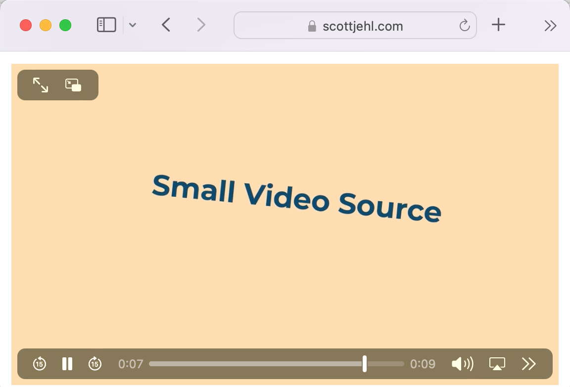
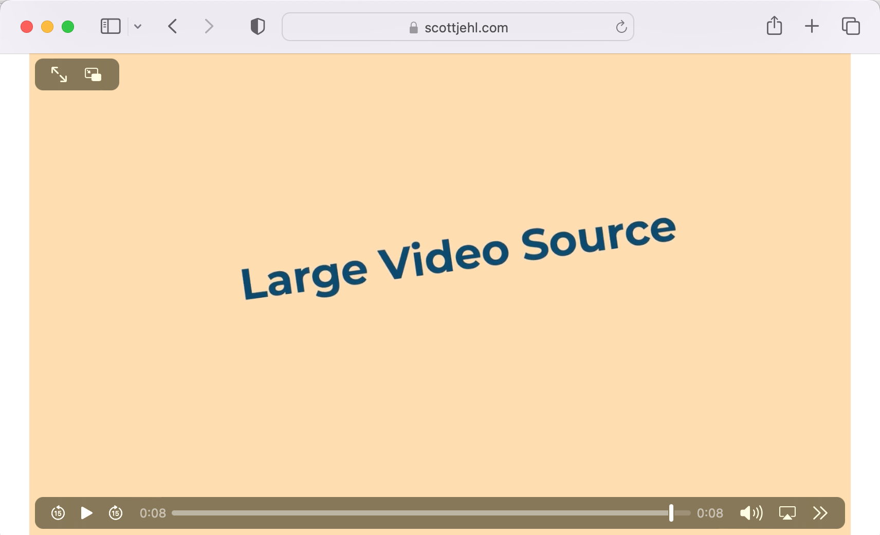
That media attribute on the first source element instructs browsers that support media queries on video source elements to only use that source when their viewport size is at least 600px wide. Those supporting browsers will skip over that source at narrower viewport sizes and choose the small.mp4 instead, and you can tell which source in play because the video displays some Word-Art-style dancing text that says which size is playing. Meanwhile, browsers that don't support responsive video will simply ignore the media attribute and pick the first suitable source, which in this case will be the large video.
Here's a link to that test page.
I'd recommend opening that page in Safari (our existing working implementation) to try it out yourself. Here are a couple of screenshots verifying that Safari negotiates the media attribute as it should.
Oh, and I should mention one detail unique to responsive video: due to the complexity involved in swapping video sources (e.g. matching timecodes, reloading heavy files, etc.), video media is assessed only at page load time, and not again after that when media changes from a browser resize (so it's not quite like picture). Basically, you'll need to refresh the page to see the video change.
Alright, Let's Fix Up Firefox!
Thanks to the beauty of open source, the Firefox and Chrome code from 2016 is still available to browse and analyze. I decided I would try to dig into those commits and see if I could make at least one of the updates myself. As a Firefox fan from the early days, I chose to start there.
I've never contributed to Firefox before, nor have I written a whole lot of C++, but I found this How to Contribute Code to Firefox guide to be incredibly helpful and encouraging.
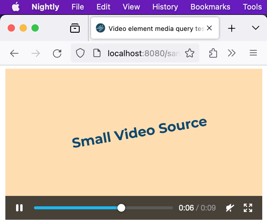
Following the initial steps, it took my aging Macbook Pro at least a few hours to clone and build Firefox Nightly, but I was pleased to see it all work without any trouble. After that, I moved on to reinstating the C++ code that would enable media attribute support in video source elements.
After a bit of tinkering with the code, I was pleased to see that responsive video seemed to be working in my local build!
Here's a screenshot of my patched Firefox Nightly loading the demo page at a small viewport size. The small video source that's shown means Firefox assessed those media queries and selected the appropriate source.
In addition to the code edits themselves, there were some previously-written web platform tests that needed to be unmarked as "expected failure" because, yep, now they're passing!
With the changes in and tests running as expected, it was time to package up the patch.
A Firefox Patch!
I submitted a patch to the Firefox team on Sept. 27th, and Paul Adenot at Mozilla has been reviewing and testing it, and providing some great feedback. If you're curious, you can check out the patch and its progress here on Mozilla Phabricator:
Patch: Implement source media for media elements and reference/update relevant platform tests
Hopefully, this patch will show up in an upcoming Firefox release! For updates on that, keep an eye on the issue on Bugzilla, or follow me on Mastodon.
UPDATE!: My patch was accepted and merged! Responsive video is now in Firefox stable.
Next up, Chromium?
With cross-browser support building, I would love to see Chromium (that is, the engine behind Chrome, Edge, Arc, and more) regain this feature soon. I'm not sure I'll have the time to try and tackle the Chromium reimplementation myself, so I'm hoping the pending addition to Firefox will help motivate someone from the browser teams or the community to jump in on that. For now, we can follow the progress in the Chromium tracker (oh hey, and star the issue!)
UPDATE!: Google wrote a patch as well. Responsive video is now in Chrome stable.
Stretch Goal: Srcset and Sizes
As a parting thought, I wanted to add that there are additional conventions that could be useful to borrow from picture, and one in particular that comes to mind is support for the srcset and sizes attributes. These have proven to be wildly successful in responsive image delivery, and I think they'd offer a level of control over delivery that's often better than media queries can provide.
I've added another issue to the WhatWG group tracker to discuss these attributes for video source selection. Feel free to chime in!
So When Can I use Responsive Video?
I'm so glad you asked! The answer is today! Heck, yesterday even.
Responsive video is a web standard again, and it has been working in Safari for well over a decade, meaning iOS users can already benefit from responsive video. Start using it wherever it makes sense for you!
Should I use this instead of streaming video?
So, probably not, if you have the choice. That is, if you're able to use streaming video protocols, by all means, do that! HLS video is designed to accommodate browser environments and connection speeds and will result in a more tailored experience. That said, if you're constrained by time, hosting environment, or even familiarity with the HLS tech, responsive video is a great option to consider.
Having said all that, one use case that I think might be better supported by responsive video is offline/PWA websites, where it might be very helpful to cache an appropriately-sized offline video. I'd be interested in hearing if others have ideas on this...
Thanks for reading!
You made it this far. Thank you for reading. I'd like to thank Eric Portis for giving this post an early read and technical review, and a very special thanks to Paul Adenot at Mozilla for guidance and for reviewing the Firefox patch.